I was going to post two more reviews of our comics, but I just couldn't overcome the guilt of my recent persistent promises to post some more interesting fare. So, just to shut y'all up, here's a peek into my process of creating comics (a caveat: this may actually be terribly UN-interesting to some). I love seeing how different artists arrive at their final products, so here's my addition to the oeuvre...
CONCEPTI figured I'd pick a short comic for this, and they don't get any shorter than one page. The upcoming
Rabid Rabbit anthology asked me for a one-pager that must also adhere to a few conceptual rules. It's going to be a square book, and the theme is "
Square One". The first panel of every artist's comic must be based on a sketch they provided of a human (that's probably open to interpretation) about to open a door. We were to use the basic composition in the sketch provided. The title of our comic should also reflect the overall concept.
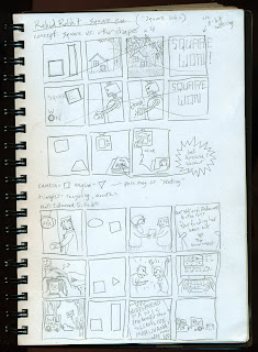
Telling an interesting story in one page is a challenge, especially when it can only measure 8" x 8" total. I decided to cram as many panels as I could onto my page. I started brain storming by reflecting on the concept's title: Square One. By changing the word "One" to the similar sounding "Won" a kernel of an idea began to take form. I decided to draw a series of short strips in which a square shape of some sort "won" against some other shape. At the end of each strip, the square would be declared the winner.
The idea of there being a winner led me to think of sports or video games. Since I loathe sports, I obviously drifted toward video games. The last video game I played involved actually putting a quarter in a slot at some dingy arcade in the '80s, so I decided to give it an old-school 8 bit feel.
I thought I'd set up each strip with a representation of the two shapes doing battle along with the words "Square vs. _____". Each strip would then end with a celebratory "Square Won!".
THUMBNAIL SKETCHOriginally I was going to do four strips of four panels each. This would leave me with only two panels to tell each story since the first and last panels were spoken for. You can see my early attempts at this format at the top of this first thumbnail sketch page. The second strip down would have actually been the first since we had to use that figure about to open the door at the beginning of our comics. So, you can see I was going to have a robot (square head) crush the doorknob (circle). I wanted to lend more visual interest by having the shapes in the first panels line up compositionally in exactly the same place in the second panels.
I was still working on the concept at this point, and I thought I'd have a man vs. nature, man vs. technology, man vs. religion, etc. theme run throughout. For instance, the first strip shows a tree standing next to a house (nature vs. man). A lightning bolt takes out the tree (rectangle) and the house (square) is left standing. The third strip was to show a Bible sitting on a table across from a television. A guy plops down on his chair and turns on the t.v., setting his coffee mug on The Bible. Yes, a scathing social satire, I know.
Two panels seemed to be too short to tell a story, so I shrunk my panels and expanded to five strips of five panels each. You can see this in the three strips at the bottom of my sketch pad. I tweaked the afore mentioned religion based strip by changing The Bible into a home workout DVD (and the coffee mug to a beer bottle). The remaining strip is on another page of the sketchbook, but I'm too lazy to scan it in.
Oh, I was worried about the rule of starting our comic with that figure opening a door in the first panel. That's why you see the shape intro panel as the SECOND panel instead of the first in the bottom three strips. Then I decided that it looked and read strangely that way, and that a title/set-up panel doesn't really count as a REAL panel.
TIGHTER SKETCH, PART 1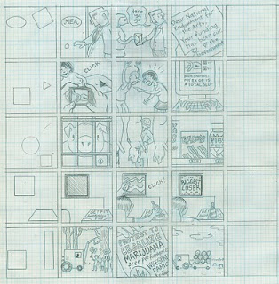
Next I drew out my fifteen panels on a piece of gridded tracing paper. I don't usually draw my panel borders using a ruler and pen (I use a brush), but I thought a more technical look would suit the video game concept. I decided to use the computer to create the first and last panels, so I left them largely blank in the sketches.
TIGHTER SKETCH, PART 2I then scanned my sketch into the computer and created the first and last panels. I'm sure it would have been easier to use InDesign or Illustrator or something like that, but I'm not proficient at either, so I stuck with Photoshop. I found some really great free 8 bit video game style fonts at a website called
Miffies after some searching on the good ol' internet.
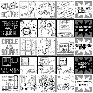
To further clarify that these are five separate stories, I dropped in alternating black and white bars of color.
TIGHTER SKETCH, PART 3As you can see, I converted the sketches to a light cyan color. This is because I've discovered (via other cartoonists) a way to cut out my least favorite step in creating comics: tracing sketches onto bristol using a non-photo blue pencil and a light-box. By converting your sketch to blue on the computer, you can just print it out onto bristol and ink right on top of it!
It's easy to do. Just scan in your sketch (greyscale, 300 dpi or higher). Adjust the 'threshold' (on Photoshop: image>adjustments>threshold) until your sketch is converted into pure black and white. You may have to fiddle with the numerical setting to not lose detail depending on how dark your sketch is. I generally set it to between 150 and 175. Next, change it into a duotone (image>mode>duotone). You only want to use one color, so select 'monotone'. Click on whatever color shows up in that first option and change the CYMK levels to: C = 25, Y = 0, M = 0, K = 0. You can make the cyan lighter (lower numerical value) or darker (higher
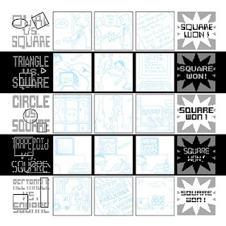
value) according to your preference. The darker it is, the more likely it will show up when you scan your final inked drawing. This will require more fiddling in Photoshop to eliminate it. However, if you print your cyan too light it is hard to see while inking.
My local print shop (
Minuteman Press) can print on bristol up to 13" x 17", so I brought in a piece of my 14" x 17" paper and they lopped an inch off one side. Actually, I don't use bristol...I use Borden & Riley 'Paper for Pens', but whatever. Since my printer at home only prints 8.5" x 14", I blew my sketch up to about 12" square and emailed it to Minuteman Press.
INKED DRAWING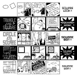
My favorite part is the inking. I try to avoid rulers and technical pens (never used a rapidograph) whenever possible. I wish I loved them like Chris Ware obviously does, but I just don't. I generally do everything I can get away with using a single brush (#2 or sometimes #0 sizes). Small details and cross-hatching are done with Pigma Micron pens, which are just disposable cheap-0 versions of Rapidographs. Since this comic was going to be reproduced in such a tiny format, I decided to keep it clean and not do any cross-hatching.
In case you care, I use Speedball Super-Pigmented Acrylic Ink or Higgins Super Black ink. Not sayin' these are the best, they're just what I use!
FINAL PIECEI usually scan larger inked drawings in parts since my scanner can only scan 8.5" x 11" paper. I then stitch them together, adjust the threshold and drop in the color. Since I was pressed for time, I decided to cough up $2 and have Minuteman Press scan it in one go on their large-format scanner.
Since you loose resolution and quality with each scan, I cropped out
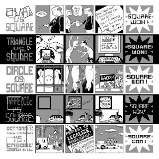
the inked drawing part of the scan and dropped it behind the opening/closing panels I'd set up on the computer. Lastly, I added the color (we were limited to just 40% grey) using my Wacom tablet and Photoshop.
And there you have it, folks!
I'd love to hear any suggestions, feedback, etc. I'm always interested in how others go about making their comics, so holler back!


